Mock up designed by rezaazmy
My role
I worked as the visual lead designer but was thrilled to work along side with the UX designer, do some user testing and collaborate during the wireframing process and problem solving. My main tasks were:
Design — Create a component library — QA developers & authors work
Design — Create a component library — QA developers & authors work
01_Design
What did not work
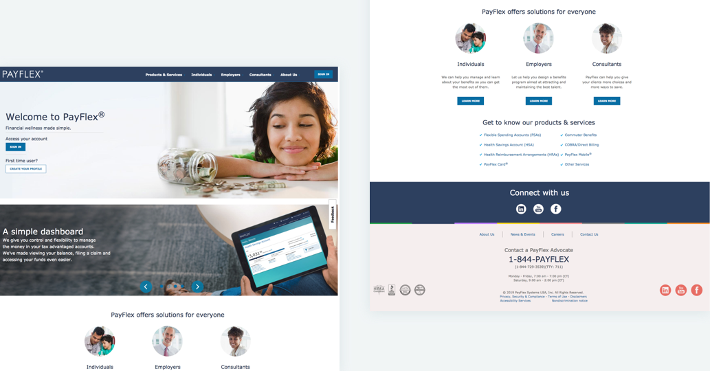
01. It is not obvious what Payflex is upon initial visit
02. Hero banners offer little contextual setup
03. No way to search content on the site
04. The site is not responsive
05. Imagery is posed and generic
Concepting
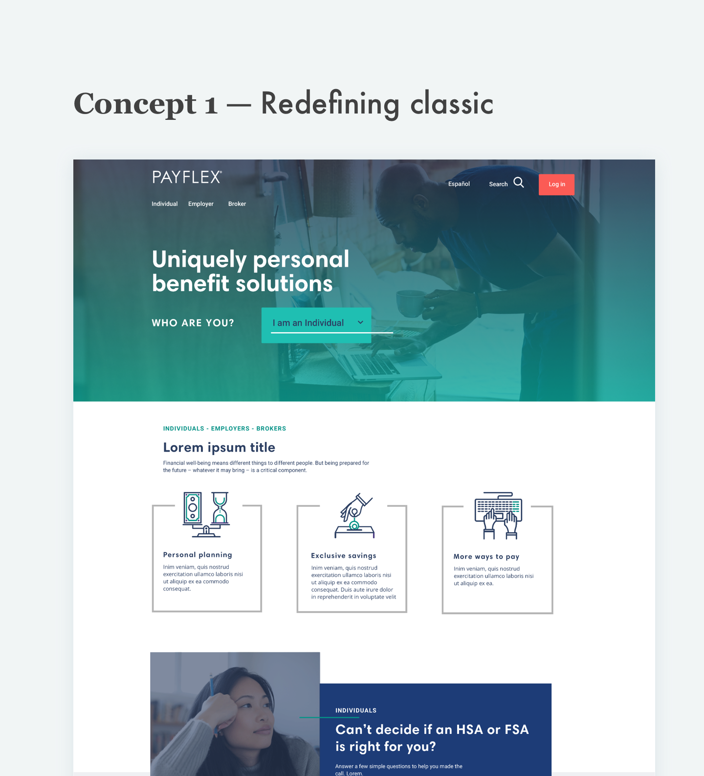
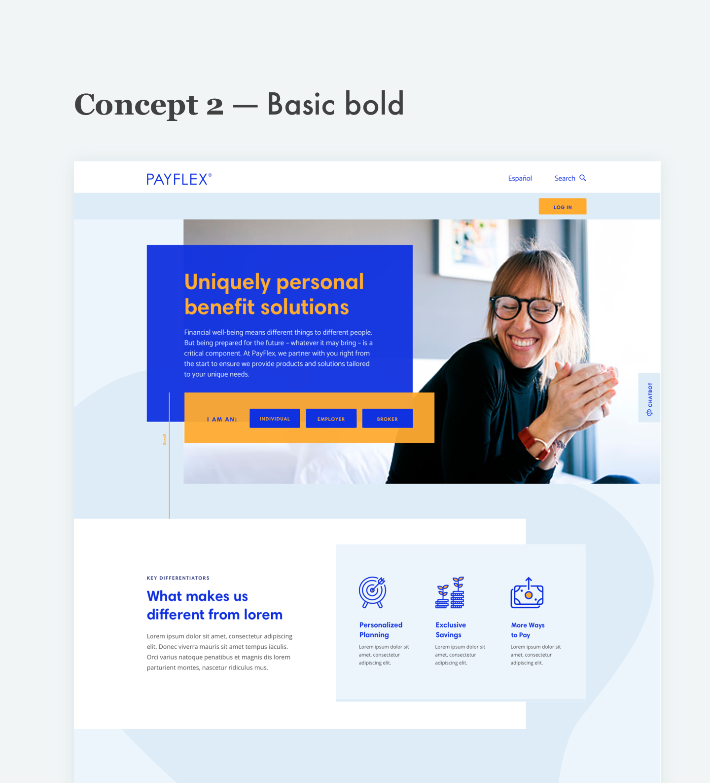
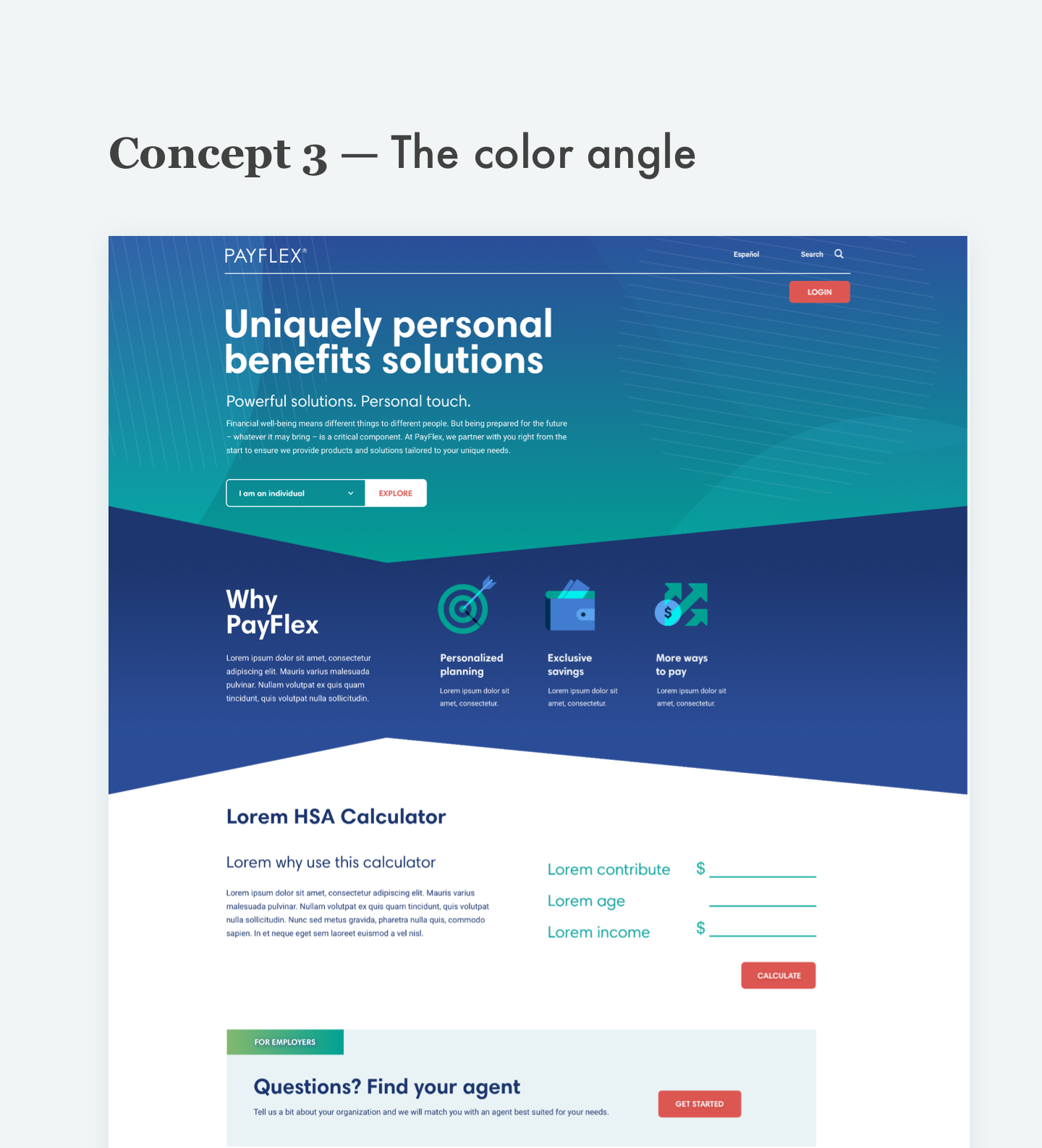
As a team, we presented 3 different concepts from 3 different designers — Second one is the initial I worked on. We had the freedom to design whatever we wanted keeping in mind simplicity and accessibility. Concept #1 was the one chosen by the client with some of the styles from concept #2.
Hands on design
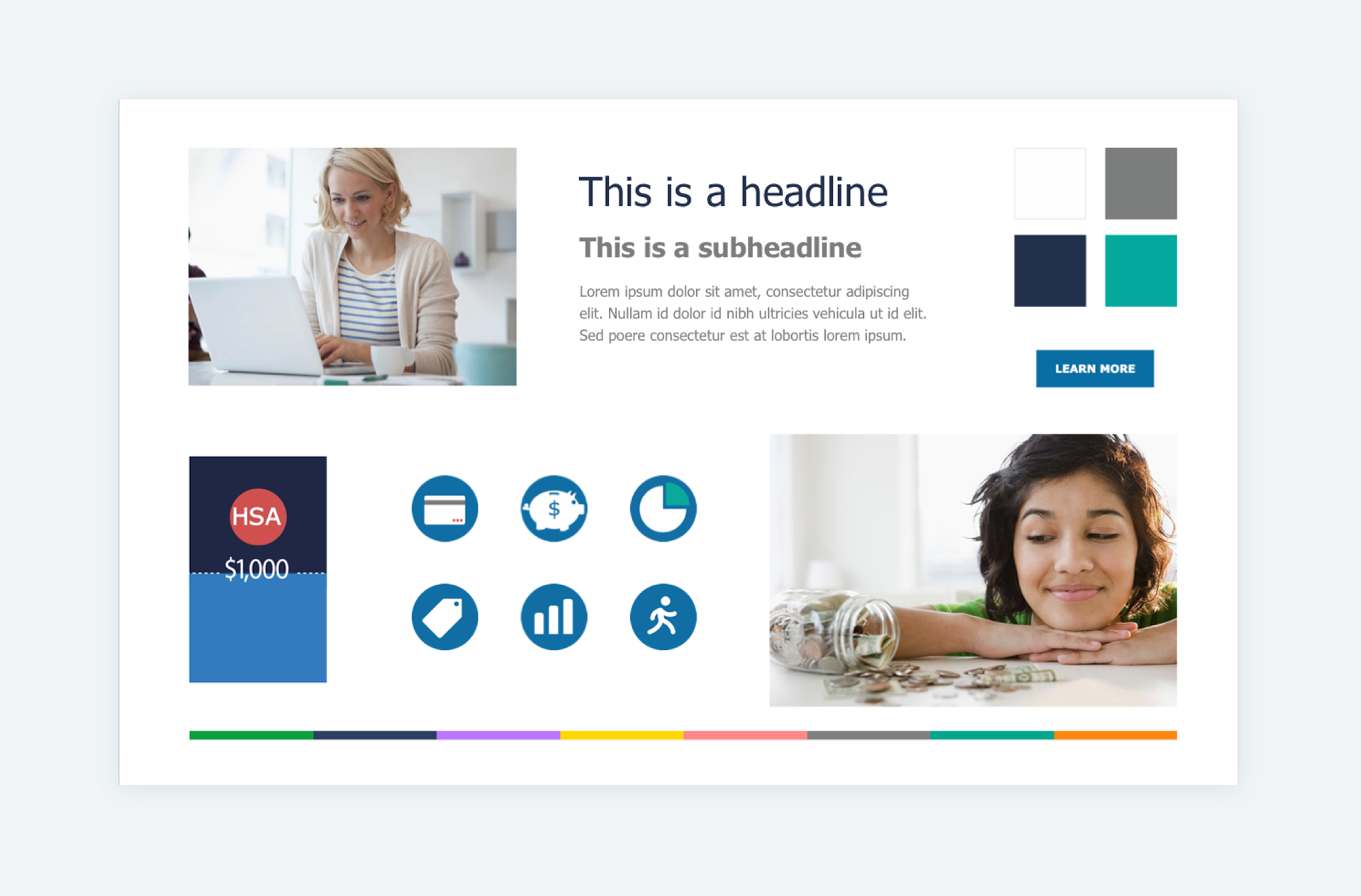
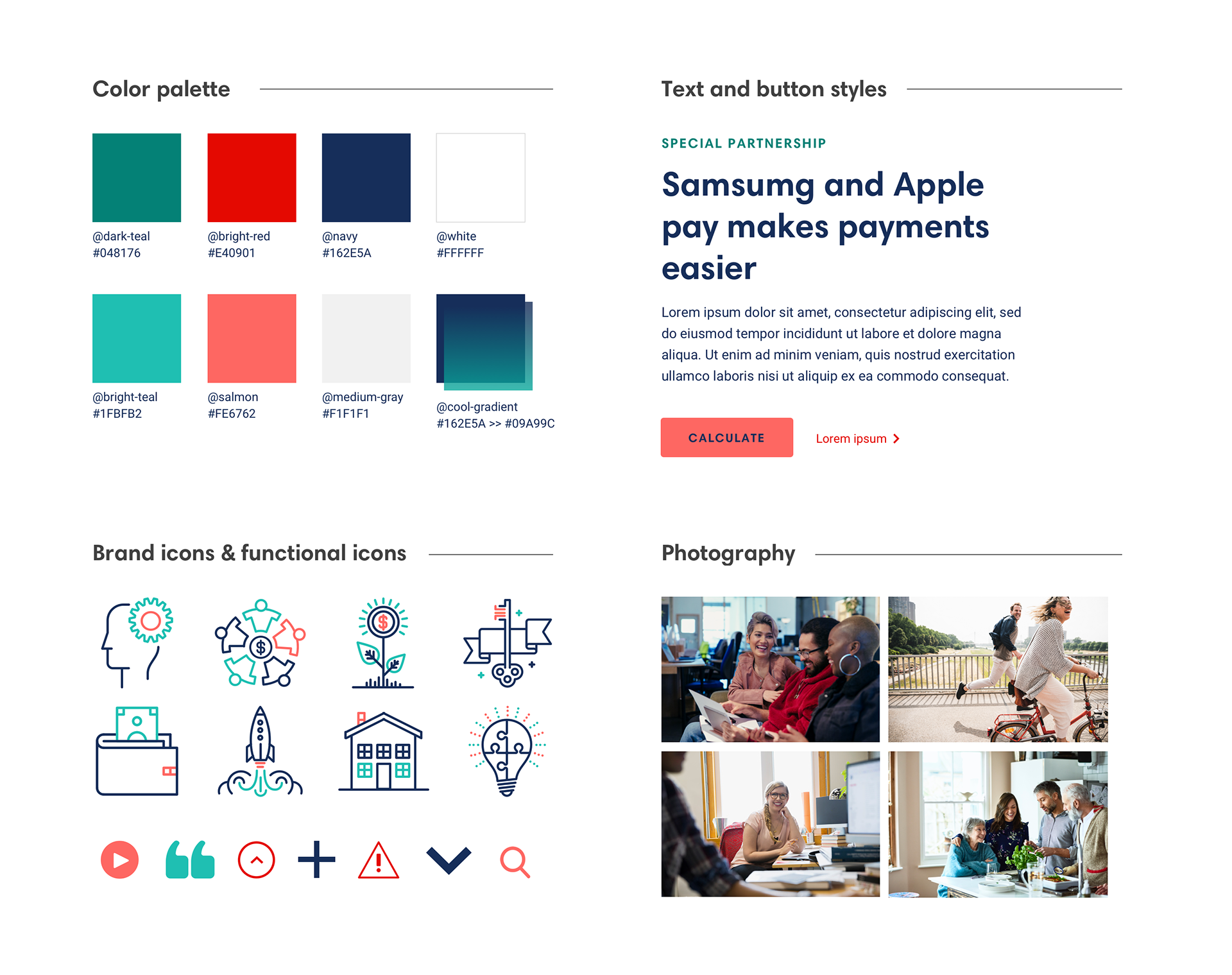
Once a direction was chosen I started working on refining the look and feel and started defining the site styles. We went from having generic photography, a rainbow of colors, outdated iconography and poor data visualization (First image) to having a more vibrant and relatable photography, a simplified color palette, a modern type of iconography and overall fresh look (Second image).
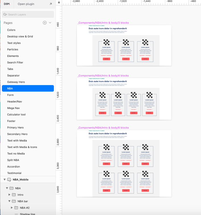
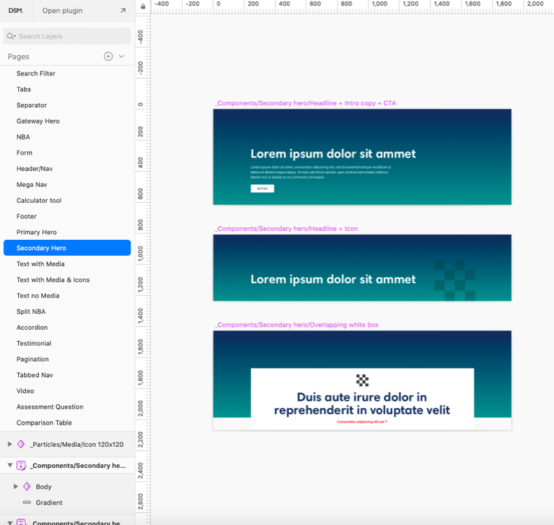
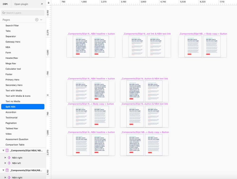
02_Build component library
With the styles defined, it was the moment to work on building a component library. I started creating components and a bunch of versions for each, such as: Hero Banners, Footer, headers, Tab, Right Rail, Gallery and a much more with a total of 30 components and 74+ variations. They were created in Sketch, assemble into a global library and uploaded to the cloud so any designer that needs to build a page for the commercial and the member site could have access to it.

03_QA developers & authors work
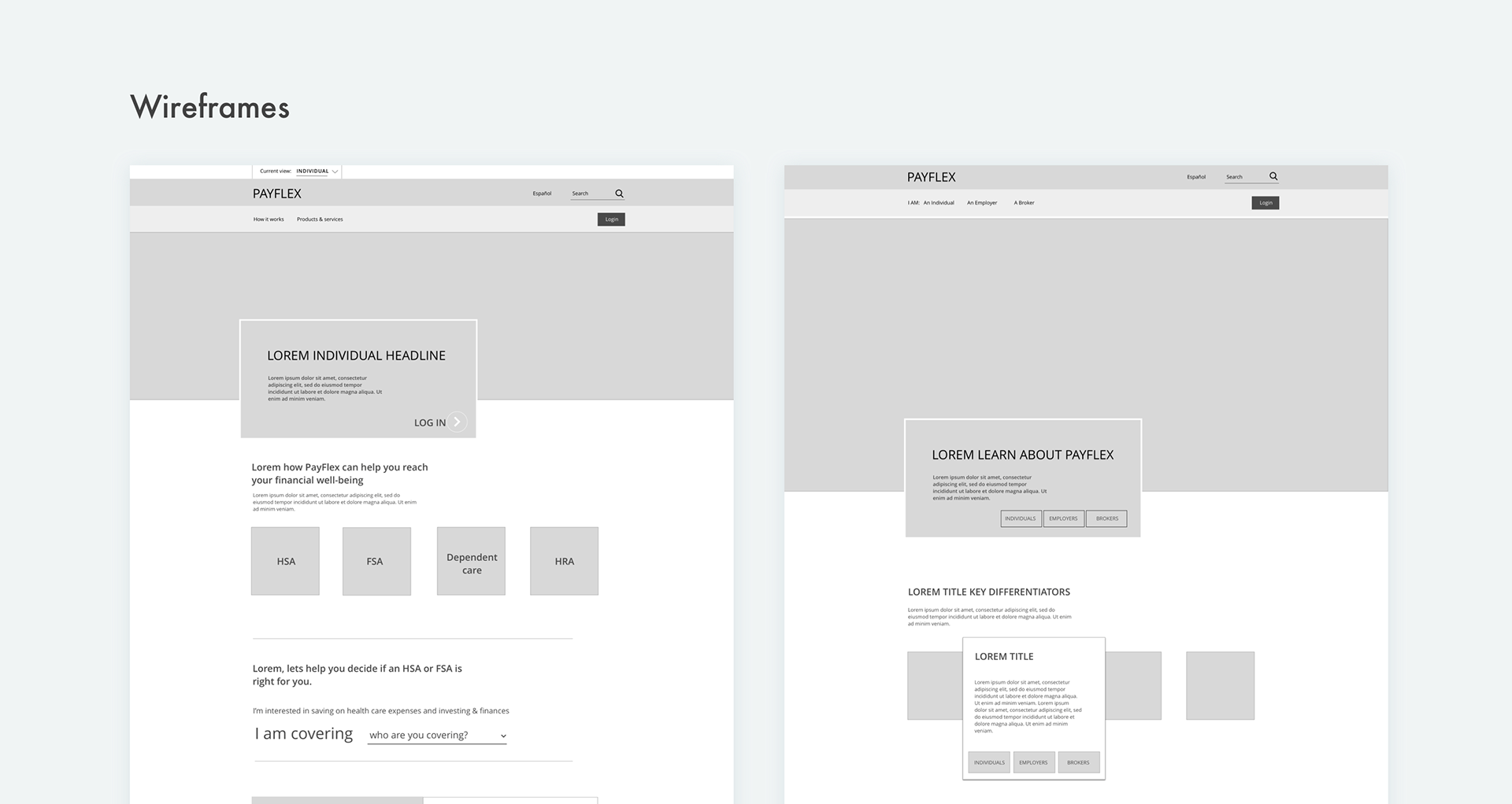
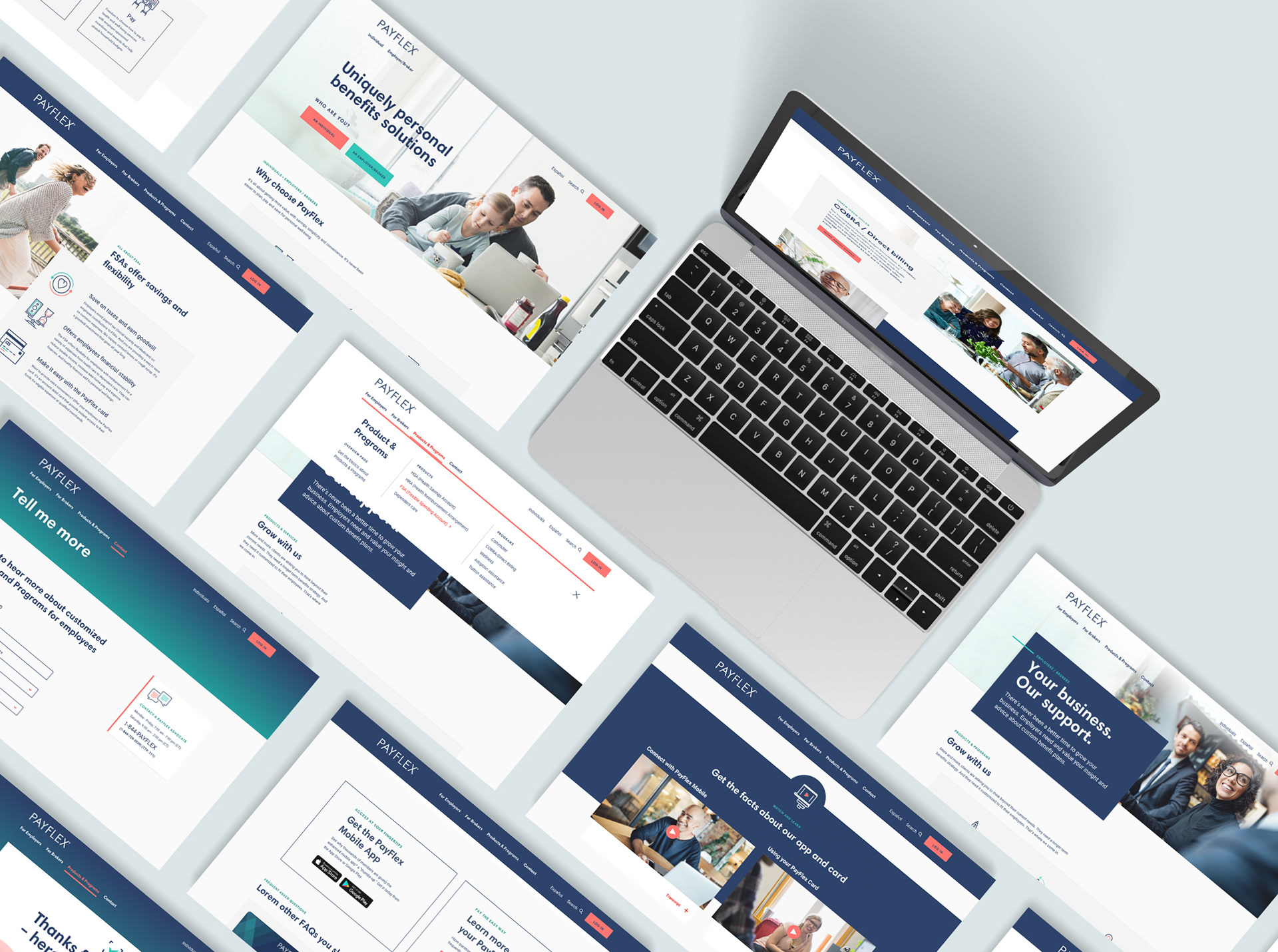
Once the Sketch Library was finished, then the building pages process began. There was around 30 pages that were designed using the Sketch components, based on the wireframes and the users flows created by the UX designer of the team. I worked closely with the developers to create the components from scratch and with the authors to put together those pages. We used Invision and JIRA as our main tools of communication and we delivered with great results within a tight schedule.
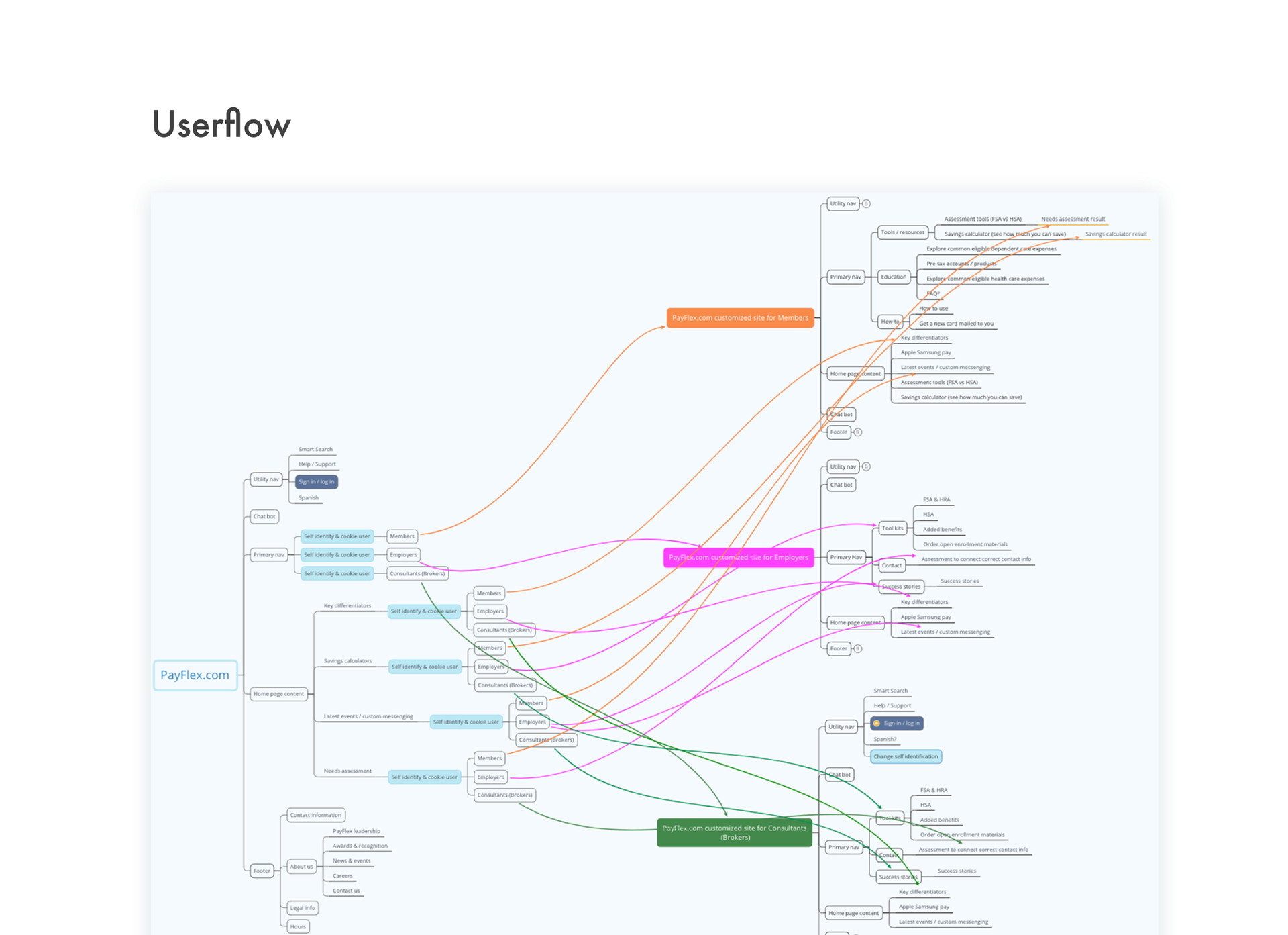
And these were the results! A complete heuristic fully responsive site and a tailored experience for Members, Employers and Brokers — the main users that visit the site.
Mock up designed by rezaazmy
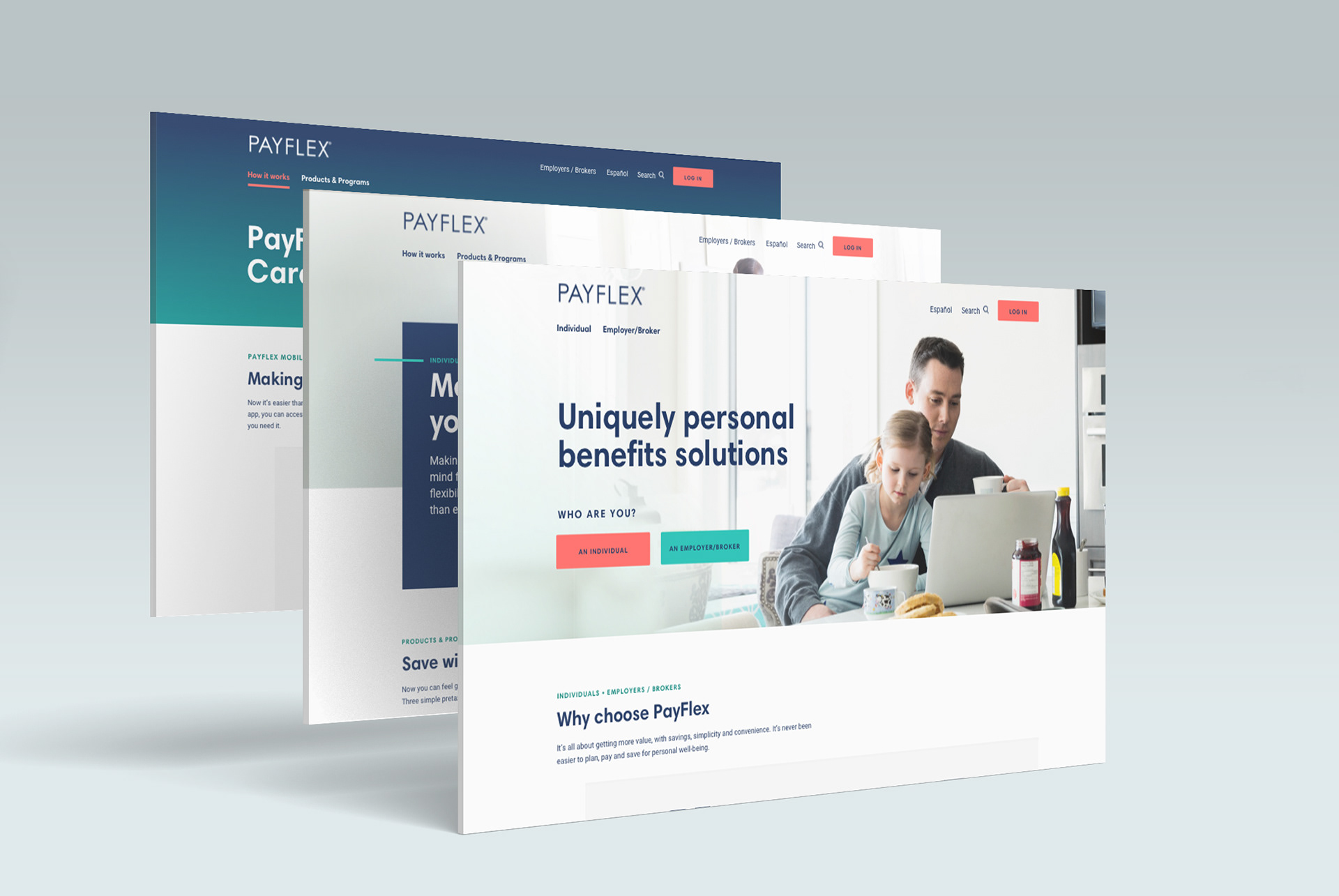
With the new look of the website a new visual identity started taking form. It translated to other mediums like mailers, powerpoint presentations, even the HSA card.
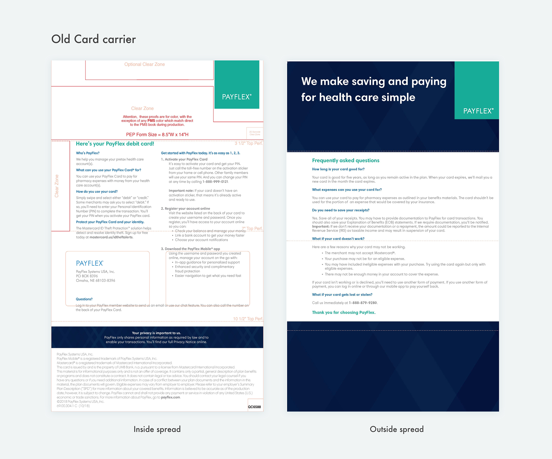
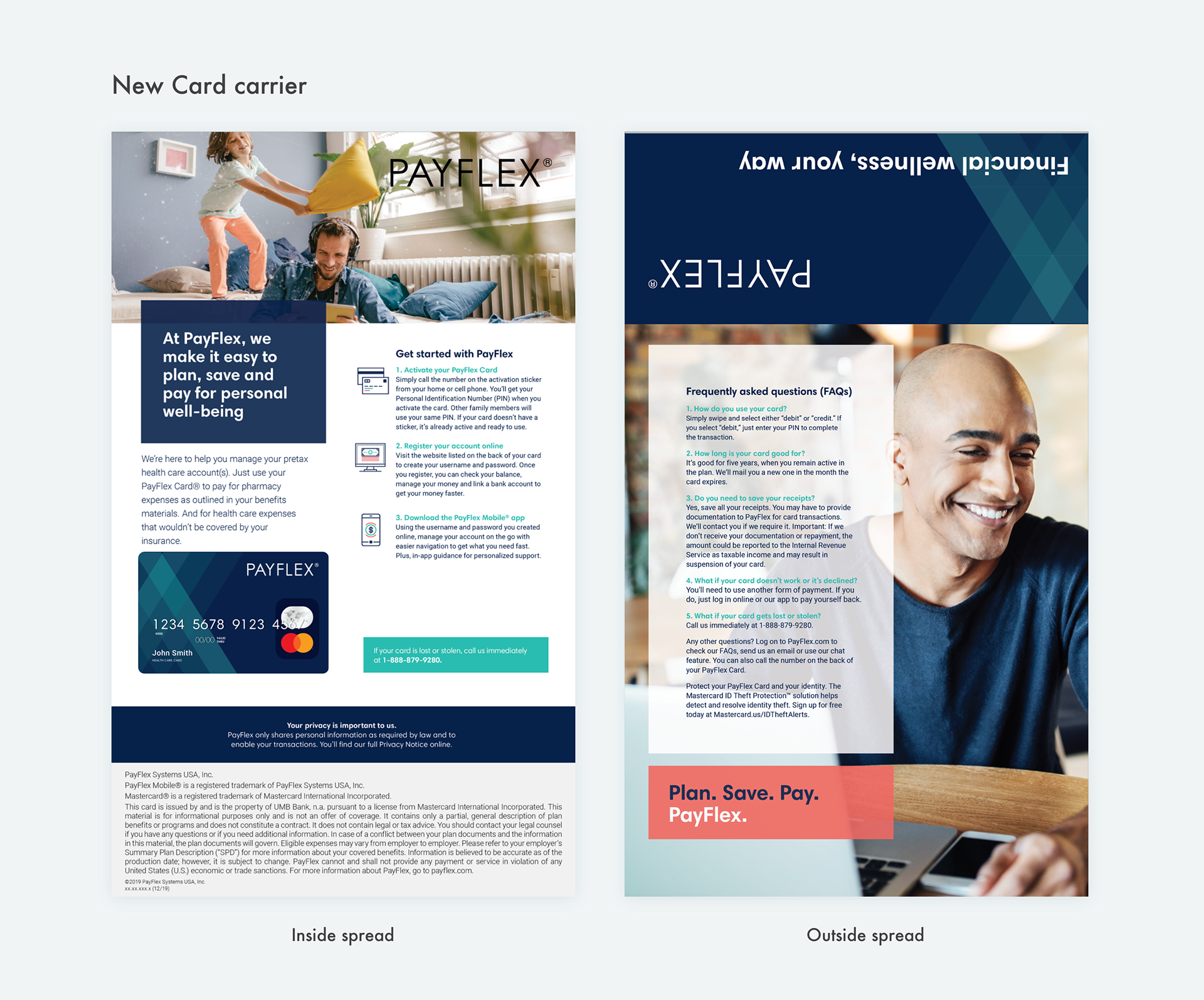
+_Side project
I was asked to re-design the HSA card and it's carrier mailer. There was a concepting process, refinement and release. This is what I came up with.
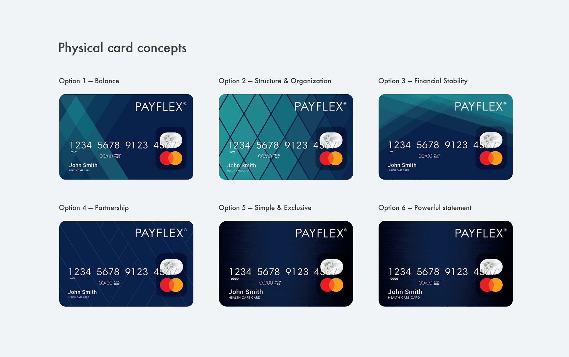
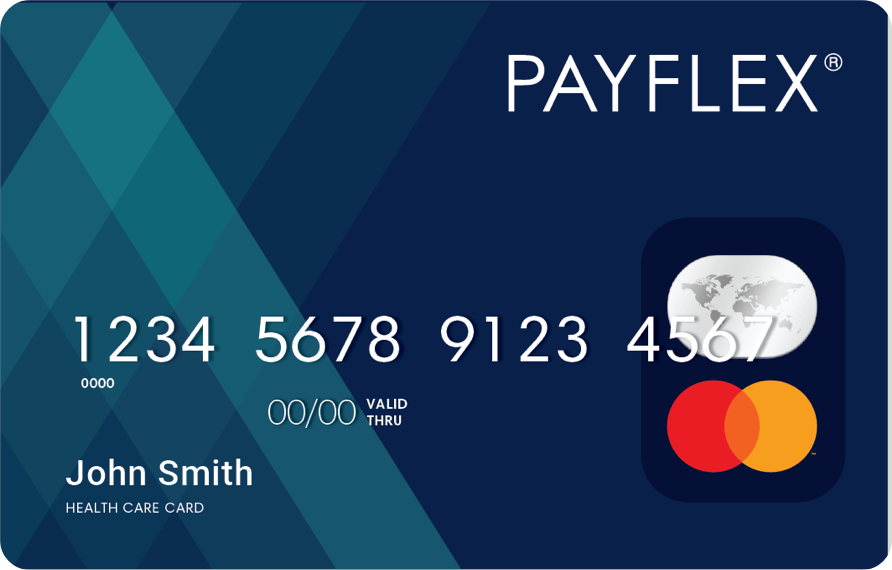
This was the winner
THANK YOU!